LetUsGather
Simplifying group and event planning for friends and family
My Role
Research, UX Design
UI Design, Prototyping, Testing
Team
1 Design Lead
1 UX Designer (me!)
Timeline
14 Weeks
Tools Used
Figma, Miro
Adobe Suite
Sector
B2C, SaaS
Scheduling
Event Planning
Process
UX Research
Contextual research
User interview
Define
User flow
Wireframing
Lo-fi Prototyping
Concept Testing
UI Design
Style guide
Hi-fi Prototyping
Design System
Accessibility Evaluation
Tests
Usability testing
A/B testing
Problem Statement
Planning with friends and family in groups of four or more is a headache due to different schedules. It gets frustrating on messaging apps such as WhatsApp or Telegram with constant back-and-forth, and most of the time, plans just don't happen.
We've All Been There…

HMW
How might we make it quick and easy to find a time that works for everyone, through a simple and intuitive digital platform?

User Interviews
10 Semi-Structured Interviews
We interviewed 10 people, around the age of 22-40 who arrange gatherings with friends and family regularly. We asked questions about :

Interesting Insights + Ideation
After interviewing 10 people about their experiences, we used affinity mapping to group and summarize the findings into three main points:

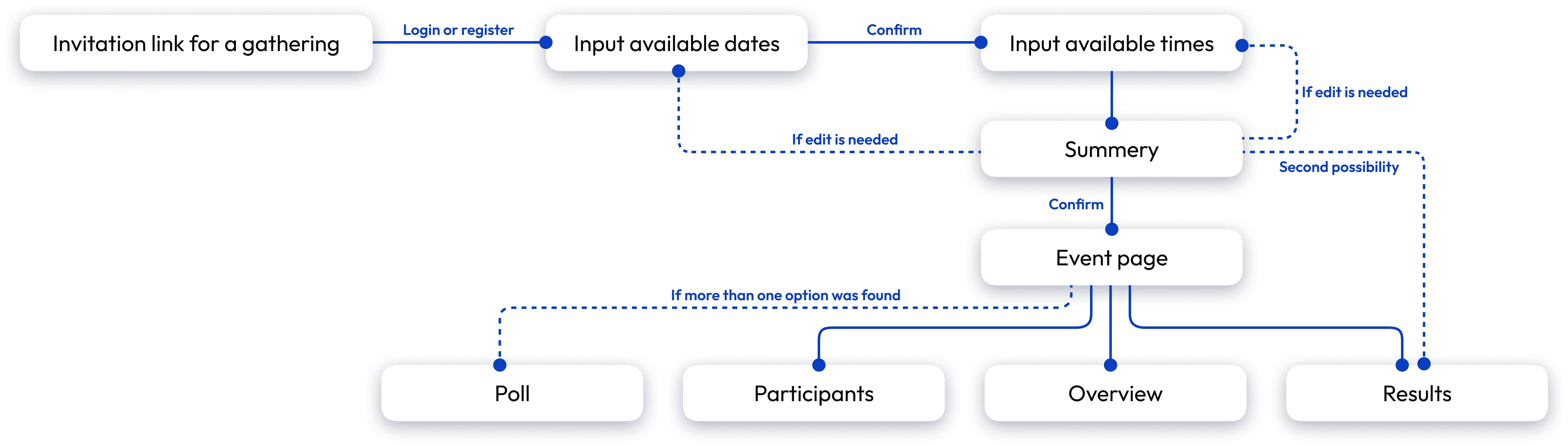
Flow Diagram
This flow covers the scenario of a participant joining through a shared event link.
Concept Testing & Feedbacks
With a broad and varied user base, we were able to validate UX flows quickly, gather feedback, and iterate. Here we show how we tested multiple ideas for the simple flow of adding an available date and time as a participant.

Insights from the Concept Testing
There was a mismatch between the user’s mental model and the design.
User’s are willing to show flexibility in their schedule, as long as they know it will help to reach a better shared time! we learned it in a hard way!
Style Guide
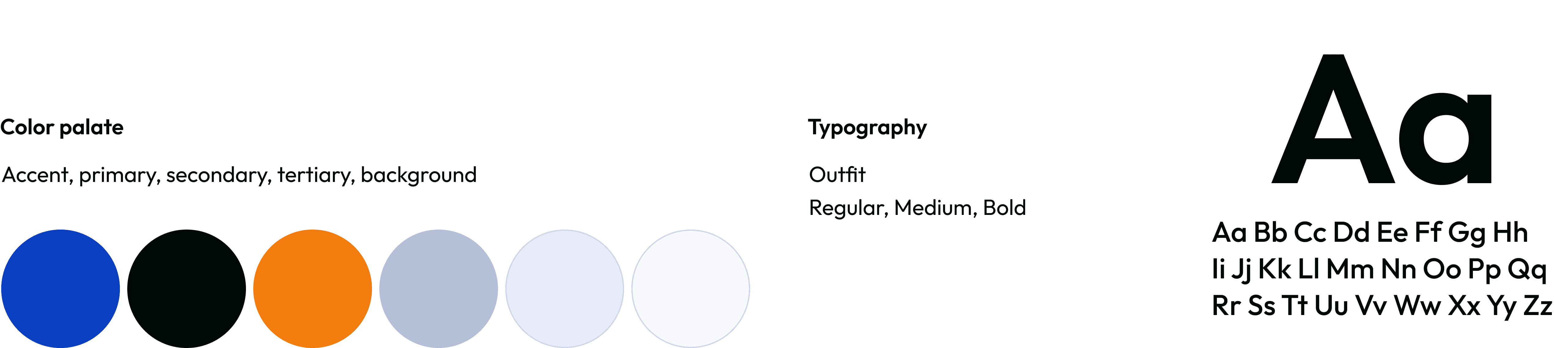
Once the user flow was completed, We started designing the main screens. We started by defining fonts and colors and the whole look and feel of the app.
Hi-Fi UI design
More than 38 high fidelity screens were created. including two different navigation patterns (a tab bar and a hamburger menu), and two different CTA button (Standard bottom sheet & Floating action button) that we used later on for A/B testing.

Alignment & Grid
An 8pt grid system was used to ensure consistent spacing and a clean, accessible design.

Hi-Fi prototype and A/B testing
We connected the high-fidelity screens into two prototypes, each exploring a different button design. Both were tested with 4 users, followed by a short interview.
Goal of the A/B testing: To find out which button (FAB or Standard sheet) users prefer for picking dates and making sure they're confident about their choices while keeping the event section (imported from synced calendar) clear to see.

Final Screens